load("C:/BLOG/Workspaces/NIT Tutorial/NIT_ws8.RData")As always, we load first our work space to continue from the previous post
Now we load the libraries we are going to use:
library(RColorBrewer)We continue exploring the Principal Component Analysis, trying to understand as best as possible our data set. One of the arguments we get from the “prcomp” calculation is the x matrix, ans with this matrix we can have a look to the map of scores for the first three PCs.
pairs(tecator_pc$x[ , 1:3])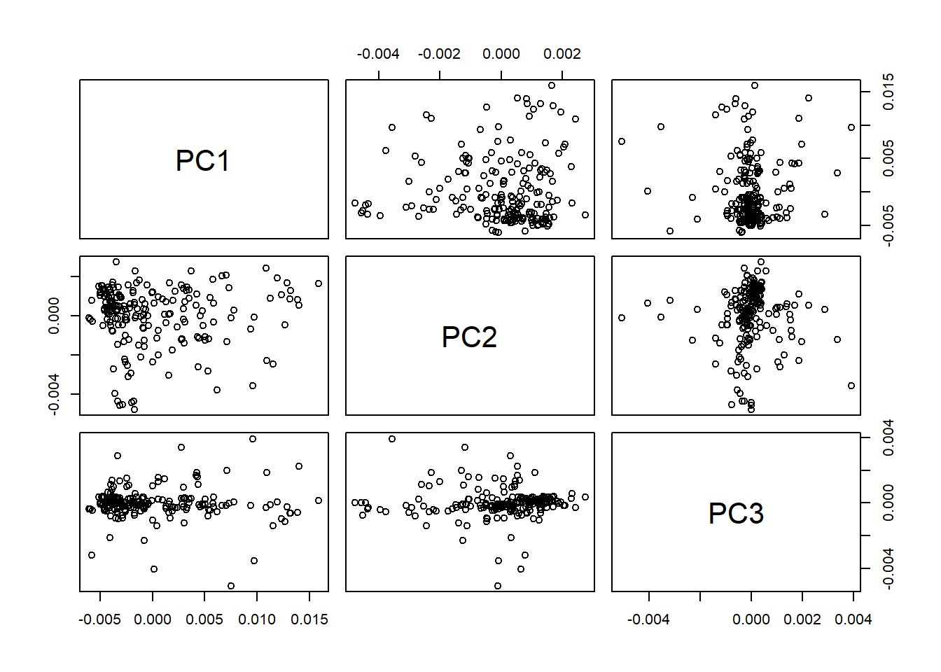
Checking the scores maps
We can order the samples by their parameter content and assigning a color scale check the distribution of the samples in the scores map, in this case the distribution of fat , moisture and protein:
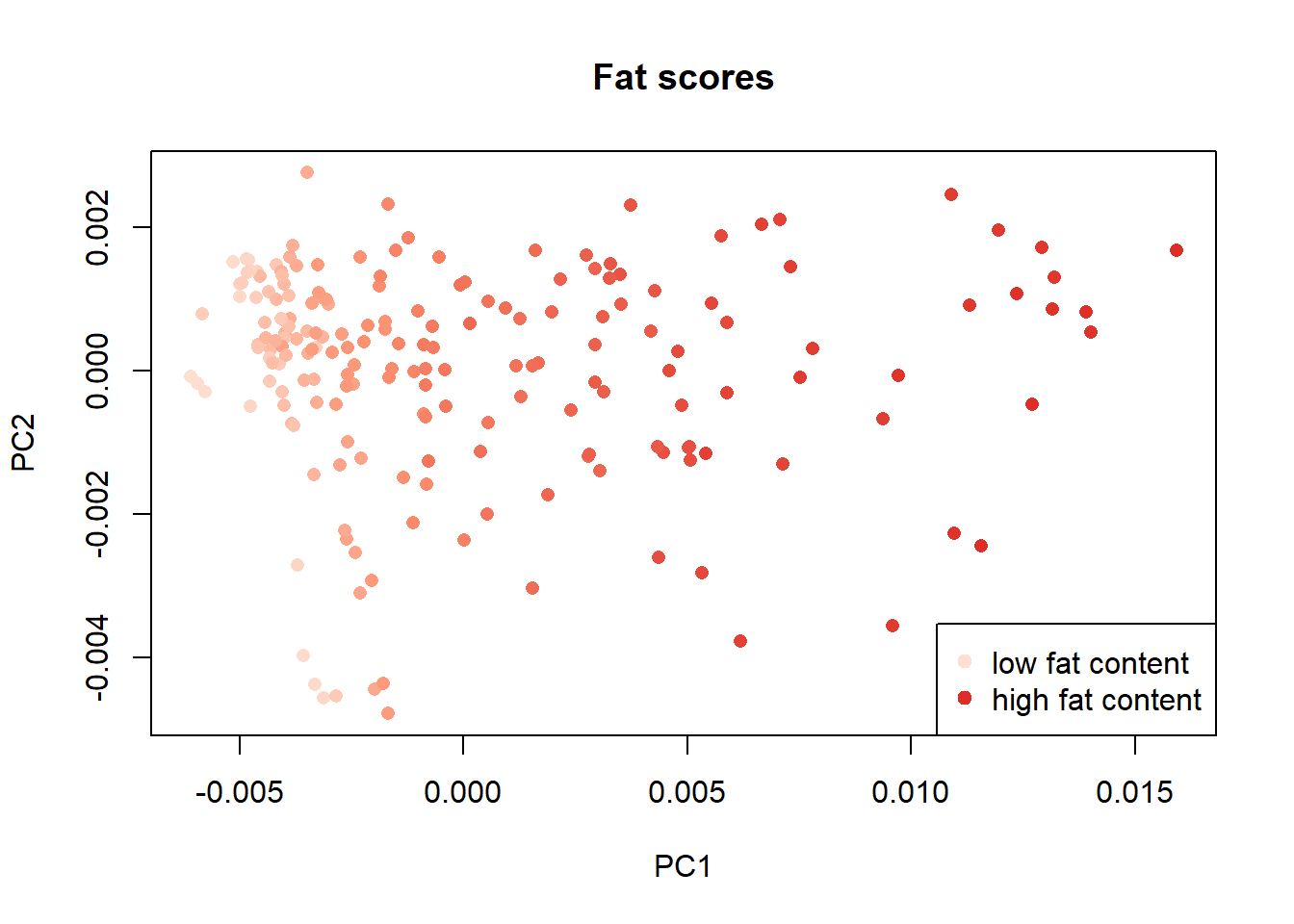
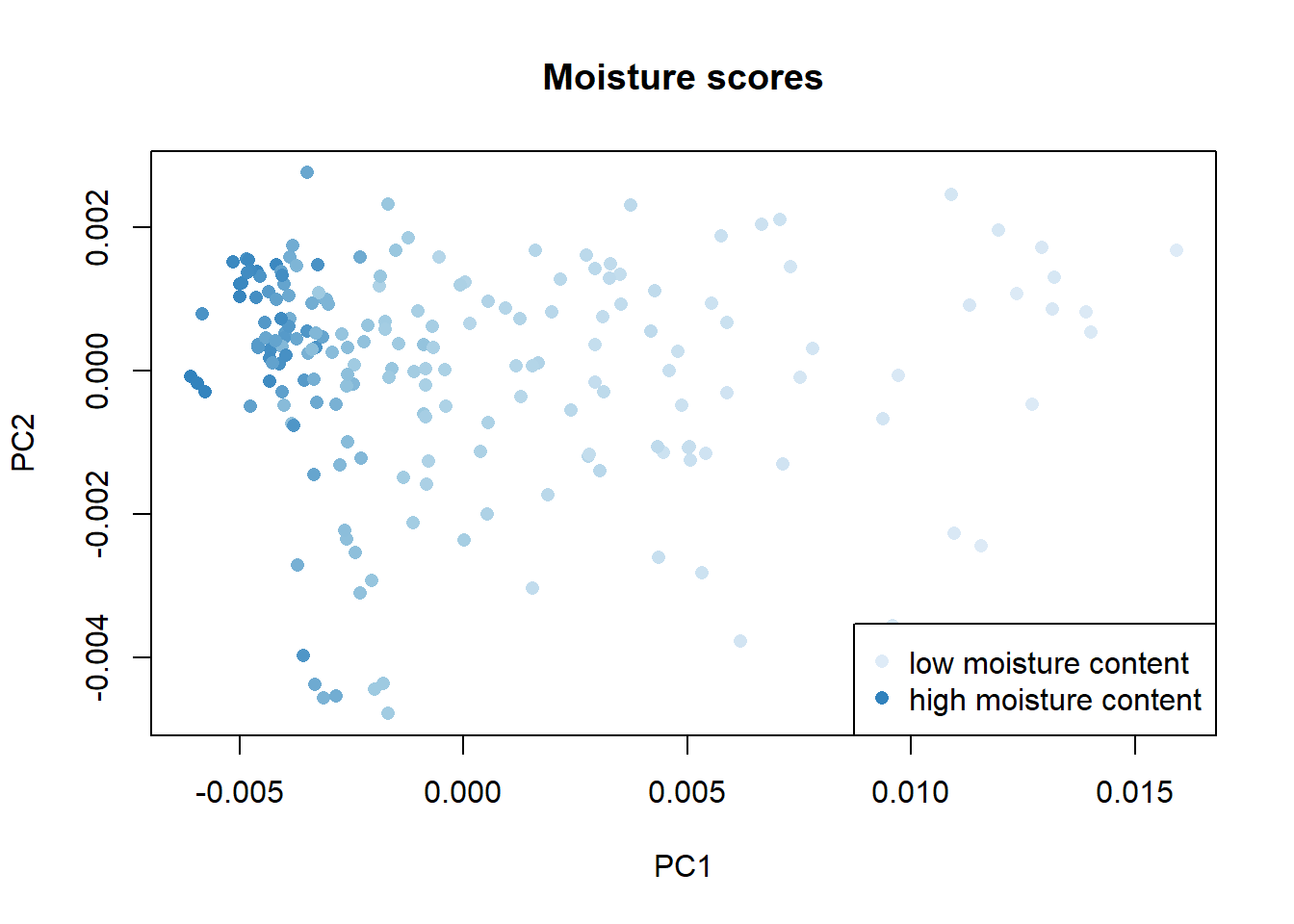
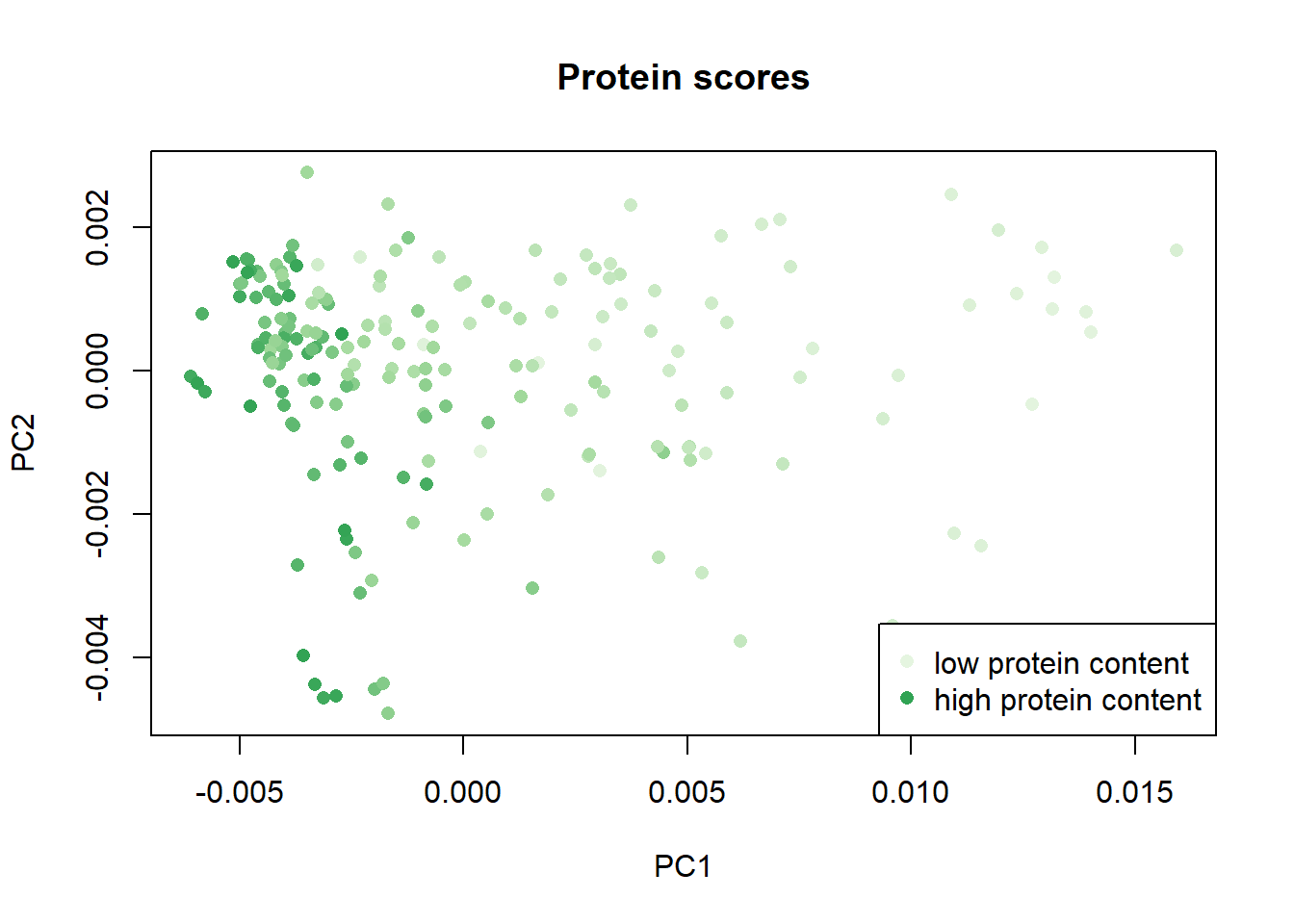
Once again with these plots we see how the parameter fat has a negative correlation with the moisture and protein parameters.
Checking the spectra wavelengths
Another option is to check if, with these color palettes, we can see the wavelengths or wavelengths areas which are more important for every parameter.
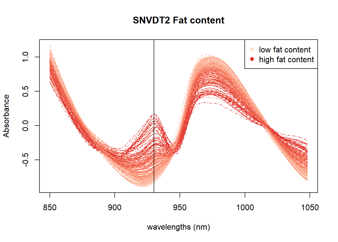
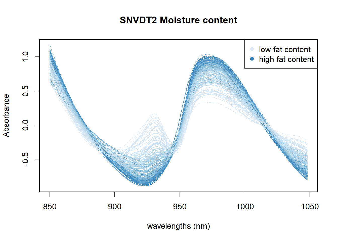
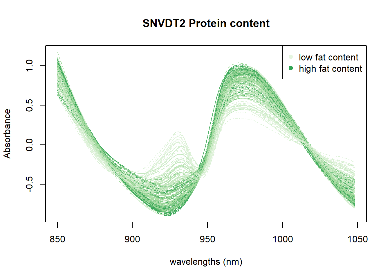
In Figure 4 we can see the positive correlation between the 930 nm band and the fat content. In Figure 5 all the area between 950 and 1000nm seems to be correlated with moisture. Finally in the Figure 6 we can see certain areas where there is a positive correlation, but we will try to see it better with other math treatments.
save.image("C:/BLOG/Workspaces/NIT Tutorial/NIT_ws9.RData")